Context
Contracting officers work with massive document libraries and complex record systems. Finding the right information quickly is critical, but traditional search just returns a list of results -- users still have to open each document to see if it's what they need.
I designed Smart Search to give users instant context without leaving the search results. The feature includes rich previews for different content types and integrates with AI Chat for deeper document exploration.
Championing a Bigger Vision
This feature was originally scoped as a small document search within a specific area of the product. But I identified a significant gap: Contract Writing had no global search experience. Users were navigating between multiple areas to find what they needed, with no way to search across the entire system.
I championed expanding the scope to create a global Smart Search that spans all of Contract Writing -- documents, records, and more. This meant rethinking the architecture to support multiple content types and designing a unified experience that works across contexts. The result delivers significantly more value than the original ask.
The Preview System
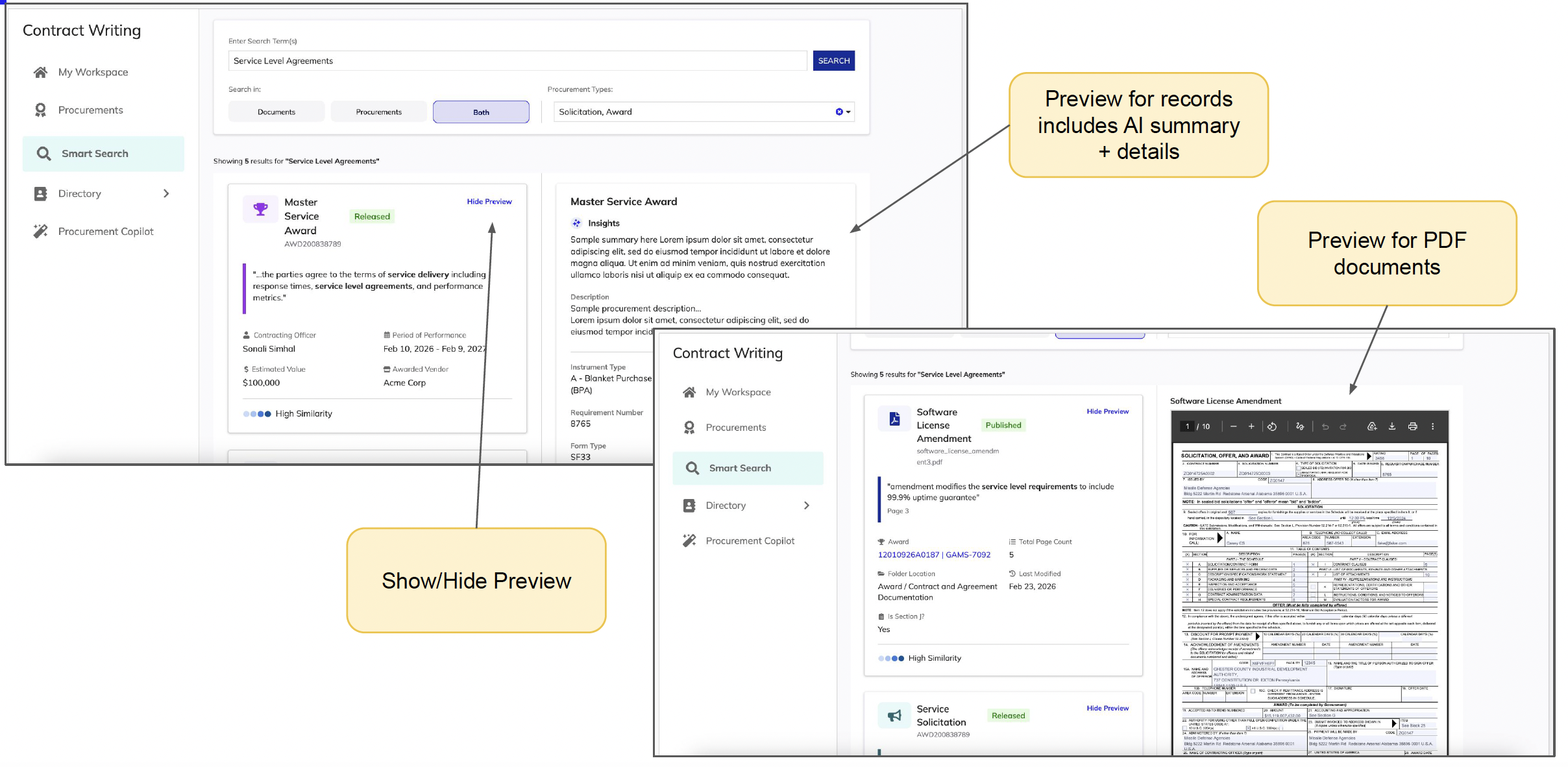
The key insight was that different content types need different preview treatments. I designed three distinct preview experiences based on the content type:
Record Previews
For records, the preview includes an AI-generated summary plus key details. This lets users quickly understand what a record contains without opening it, and the AI summary surfaces the most relevant information based on their search context.
PDF Document Previews
PDF documents get an inline document viewer that renders the actual content. Users can scroll through the document right in the preview panel, making it easy to verify they've found what they need before committing to open the full document.
Non-PDF Document Previews
For other document types (Word docs, spreadsheets, etc.), we show metadata and a download option. The preview still provides value by surfacing document properties and helping users identify the right file without downloading everything.
AI Chat Integration
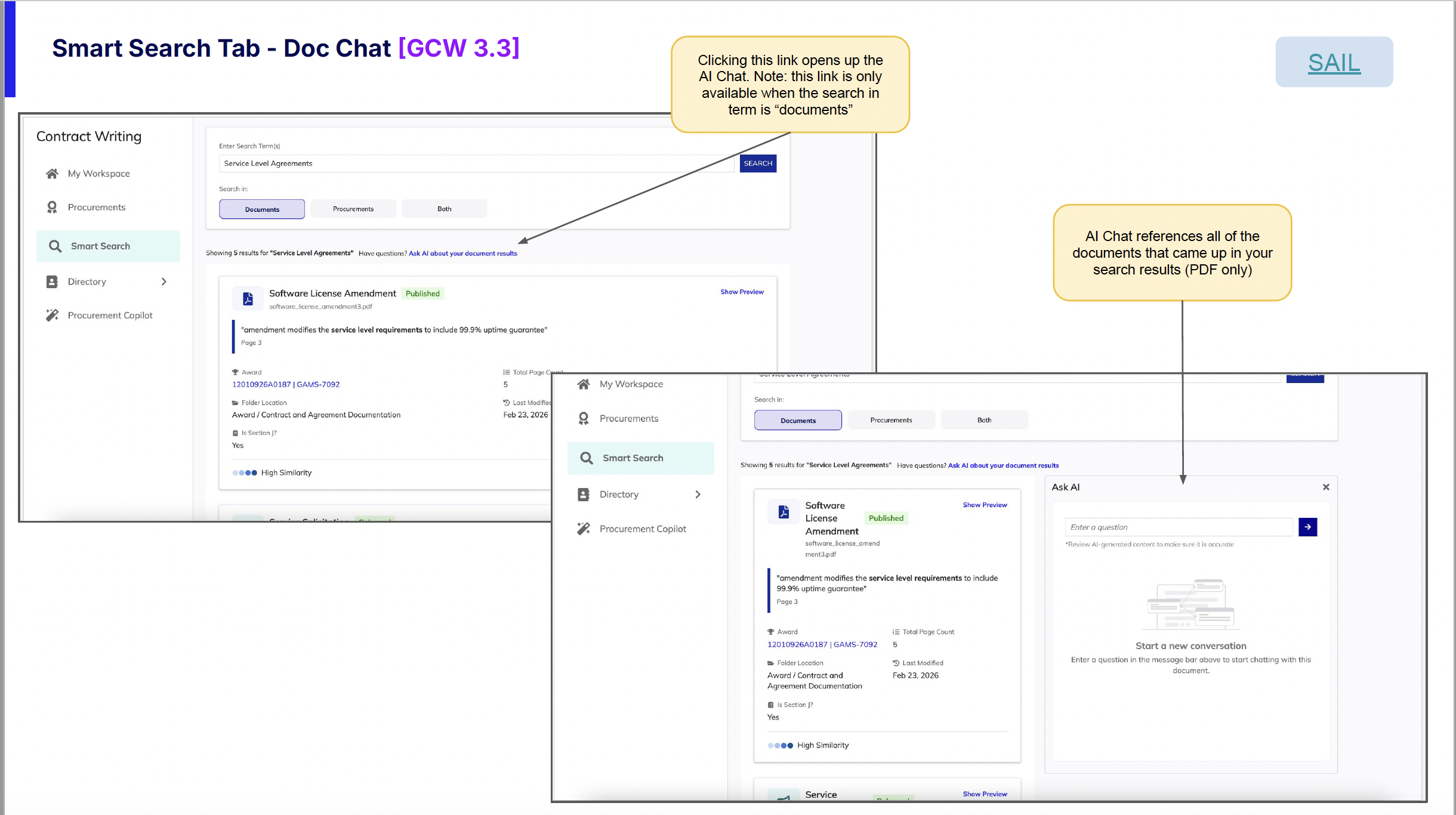
I championed adding AI Chat integration to Smart Search. The insight came from watching users struggle with large search result sets -- even with previews, they still had to mentally synthesize information across multiple documents to find what they actually needed.
My idea: let users narrow down their search and pinpoint information without having to go through each document individually. By connecting search results directly to the Procurement AI Copilot, users can ask questions across all their results at once.
How It Works
When searching with the "documents" filter selected, a link appears that opens the Procurement AI Copilot. The AI Chat automatically references all PDF documents from the search results, so users can ask questions across multiple documents at once. It's like having a research assistant who has already read everything you found and is ready to answer questions.
Key Design Decisions
Show/Hide Toggle for Previews
Not everyone wants previews all the time. I added a simple toggle so users can collapse the preview panel when they just want to scan a long list of results quickly.
Thoughtful Empty States
Empty states are often overlooked, but they're critical moments for user guidance. I designed empty states that explain what to do next and help users understand the search system's capabilities.
Contextual AI Entry Point
The AI Chat link only appears when it's relevant (document searches with PDF results). This keeps the interface clean and avoids showing options that won't be useful in the current context.
Context
Government contracting officers deal with a mountain of regulations, policies, and institutional knowledge that changes constantly. The Procurement AI Copilot is an AI-powered assistant I designed to help them cut through that complexity -- giving them a fast way to ask questions and get answers grounded in their own agency's documents.
The big design challenge here was trust. These users make high-stakes decisions, so the AI couldn't just give answers -- it needed to show its work. I designed the experience around source citations, confidence indicators, and document selection so users always know where an answer came from.
Key Design Areas
Chatbot Interface
A conversational interface where users ask questions and receive AI-driven, contextually relevant responses tailored to the agency's unique operational needs, drawing directly from uploaded agency documents.
Dashboard Analytics
Key performance indicators including query resolution rates, frequently asked questions, and chat utilization metrics. Helps identify common queries and knowledge gaps for training and process improvement.
Document Management
Centralized document upload process that makes institutional knowledge easily accessible, maintaining an up-to-date repository of information crucial for efficient contracting.
Configurable Settings
Settings to tailor the AI Copilot experience to specific agency needs and procurement workflows.
The Experience
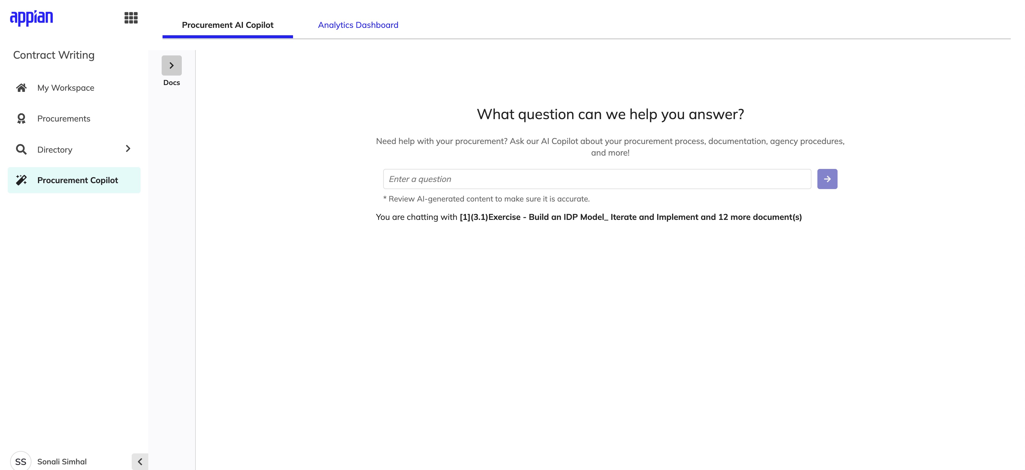
The shipped Copilot experience spans document selection, conversational Q&A, and source transparency -- all within a single interface.
Chat Interface
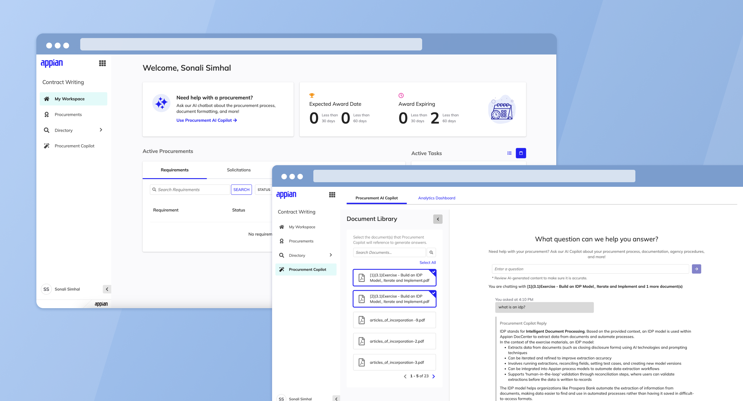
The landing state opens with a focused prompt and a collapsible Document Library. Users can scope the AI's context before asking their first question, reducing irrelevant answers.
Landing state -- clean prompt with the Document Library collapsed by default.
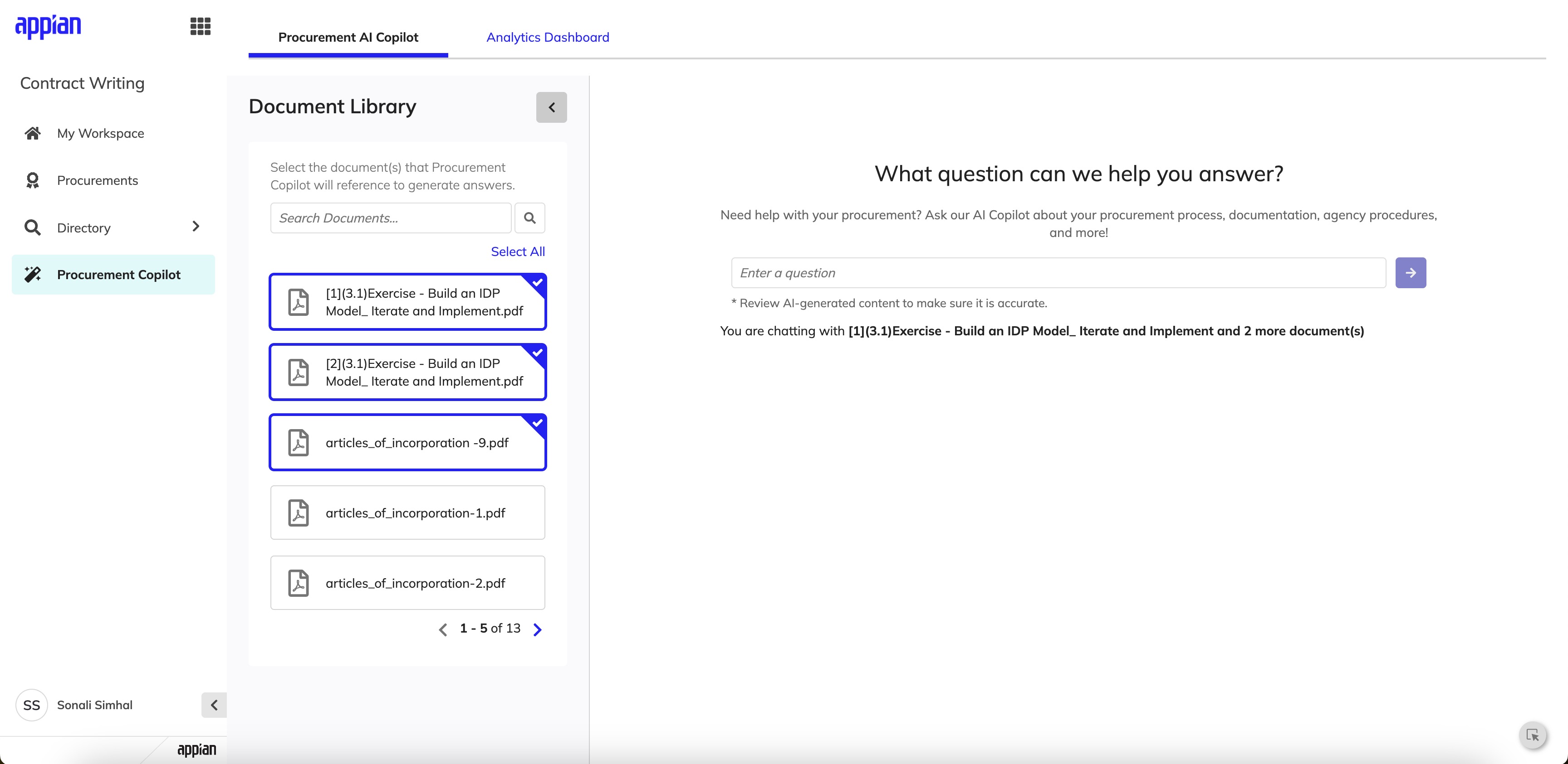
Expanded Document Library -- users select which documents the AI references.
Responses & Source Transparency
AI responses are structured with clear formatting and followed by expandable source citations. Each source includes the document name, page number, and a similarity score so users can verify answers without leaving the conversation.
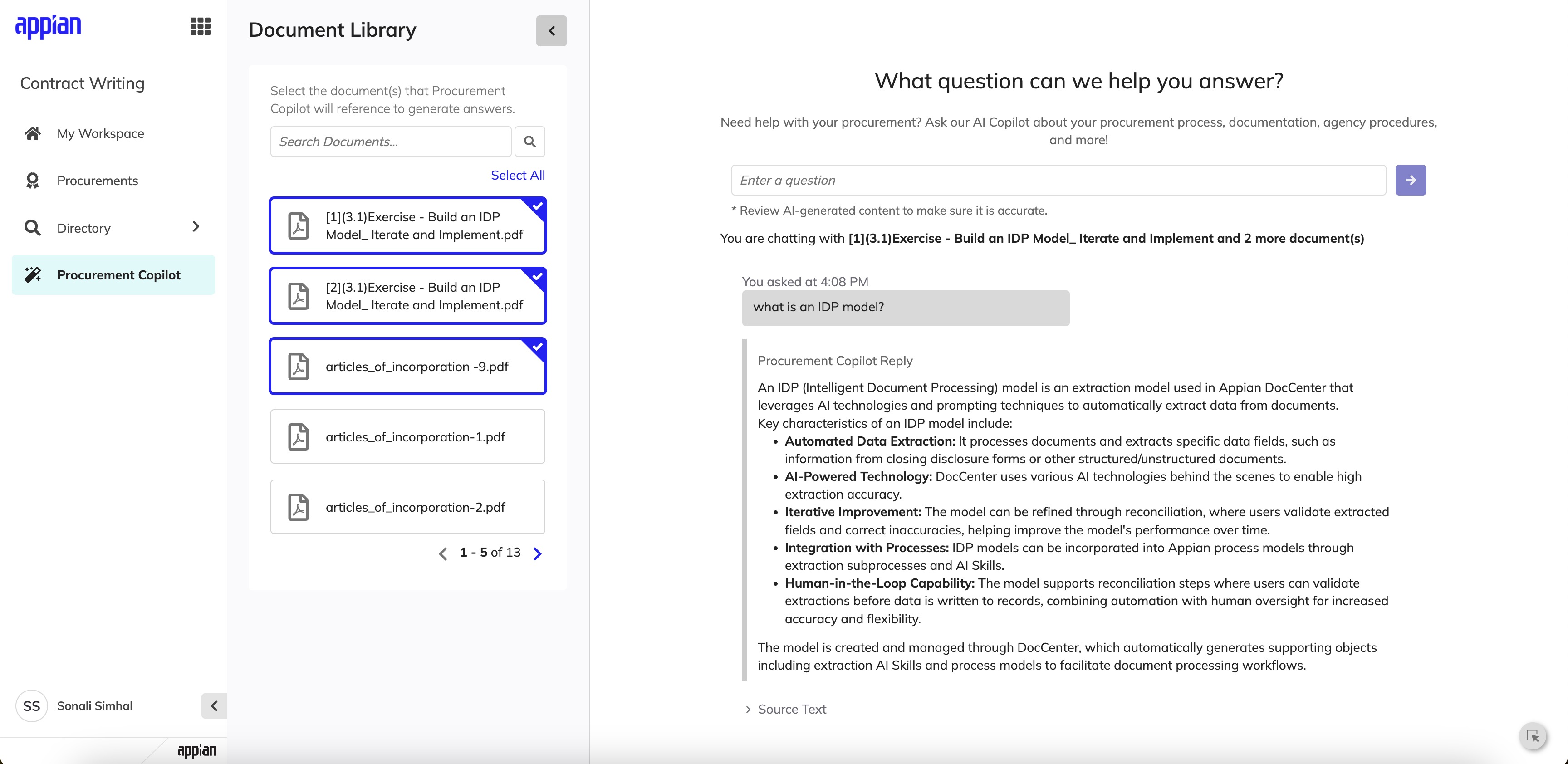
Structured AI response with contextually relevant bullet points drawn from selected documents.
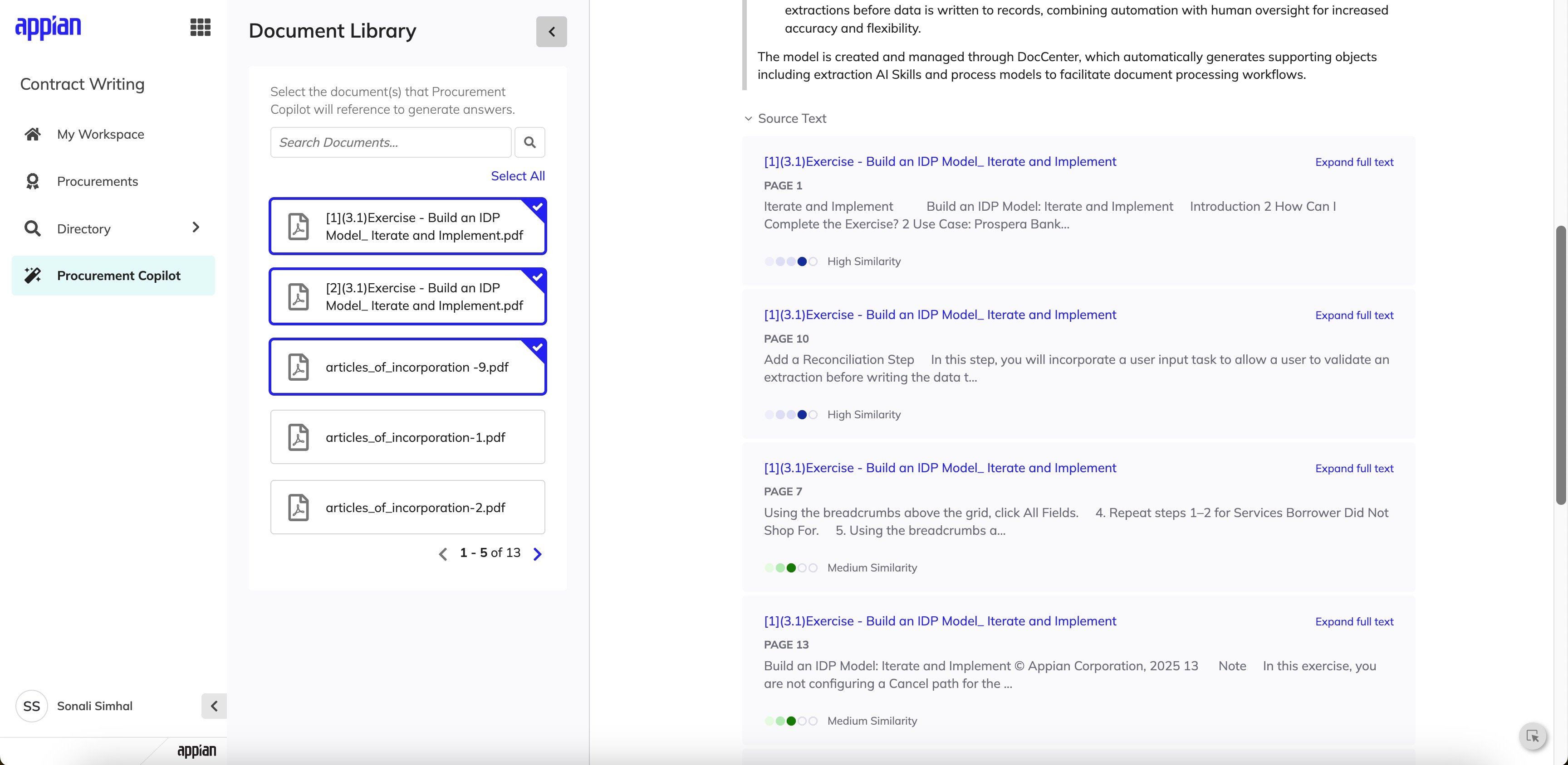
Source citations with page numbers and similarity scoring for full transparency.
My Influence & Tradeoffs
Championing WCAG Accessibility Standards
Government tools must serve all users, including those with disabilities. I pushed to ensure the entire Procurement AI Copilot followed WCAG accessibility guidelines from the start -- not as an afterthought. This meant proper keyboard navigation for the chat interface, screen reader support for AI responses and citations, sufficient color contrast ratios, and focus management when new content loaded. I pushed to prioritize this on the backlog since building it in from day one was far more efficient than retrofitting later, and it resulted in a more usable experience for everyone.
Context
Here's the fundamental challenge: CW is supposed to be the source of truth for contract data, but it doesn't sync two-ways with the Federal Procurement Data System - Next Generation (FPDS-NG). So when validation errors come back from FPDS-NG, users have to go fix things in CW and re-send -- but that workflow was really confusing before I redesigned it.
These aren't minor annoyances. Errors at this stage can block award releases, delay procurement timelines, and create real compliance risk.
The Problem
Contracting officers could successfully create a CAR from CW, but if validation errors occurred after initial creation, users were forced into a fragmented workflow:
- •Errors surfaced late and were difficult to interpret
- •It was unclear where fixes needed to be made (CW vs FPDS-NG)
- •Users often discovered issues at the point of award release, when time pressure was highest
- •There was no clear path to reconcile discrepancies while reinforcing CW as the system of record
The experience increased rework, confusion, and delayed releases.
My Role
I led end-to-end UX design for this feature, partnering closely with product management and engineering. My responsibilities included:
- •Discovery and stakeholder alignment
- •User flow mapping across CW and FPDS-NG
- •UI design for error states, sync actions, and validation modals
- •Edge case documentation and design specs
Behind the Scenes
This wasn't a project where I could just jump into Figma. I spent a lot of time mapping out how data actually flows between CW and FPDS-NG before I designed a single screen.
System Mapping
I mapped every touchpoint between CW and FPDS-NG to understand where data could fall out of sync. This diagram became my reference point for every design decision.
Edge Case Documentation
I documented 15+ error scenarios with my PM -- from partial syncs to timeout failures. Each one needed a different message and recovery path, so I catalogued them all before designing.
Stakeholder Walkthroughs
I walked through each error flow with contracting officers to validate that my language made sense in their world. Their feedback reshaped how I framed error messages entirely.
Design Iteration
I went through multiple rounds of design, testing different information hierarchies in the validation modals. The final version groups errors by severity so users tackle the most critical issues first.
Design Goals
Reinforce CW as the source of truth
Surface validation errors at the moment users can act
Make errors understandable, scannable, and actionable
Reduce cognitive load during high-pressure release workflows
Design for complex system states, not just happy paths
The Experience
The shipped error recovery flow spans sync initiation, validation surfacing, error resolution, and award release -- designed to keep contracting officers confident at every step.
Sync & Validation
Rather than treating updates as a background process, I introduced an explicit "Sync CAR" action that makes data transfer intentional. After syncing, a validation modal appears immediately -- surfacing the total error count, clear instructions to resolve issues in CW first, and a distinction between CW-fixable and FPDS-NG-only errors.
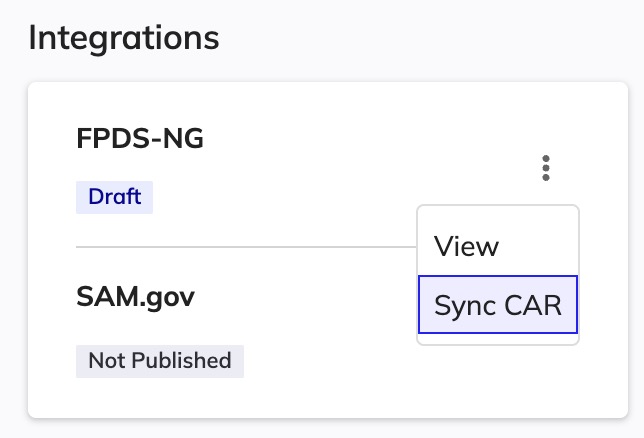
Explicit "Sync CAR" action -- making data transfer intentional, not automatic.
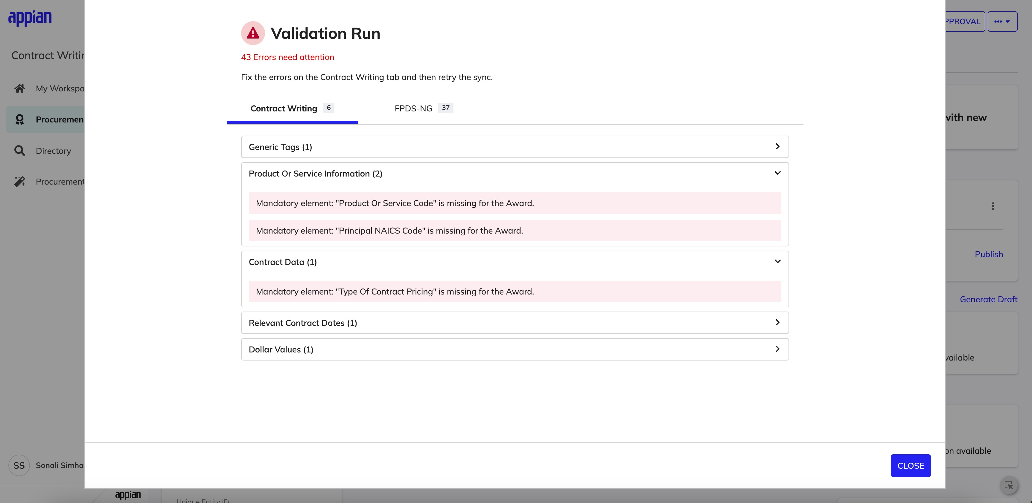
Post-sync validation modal -- errors surfaced immediately, grouped by source system.
Error Ownership & Scanability
Errors are separated into tabs -- CW + FPDS-NG (fixable in CW) vs FPDS-NG only (informational or external) -- so users immediately know which issues they can act on. Within each tab, errors are grouped by CAR category with counts and collapsible sections to reduce cognitive load.
CW tab -- errors the user can resolve directly in Contract Writing.
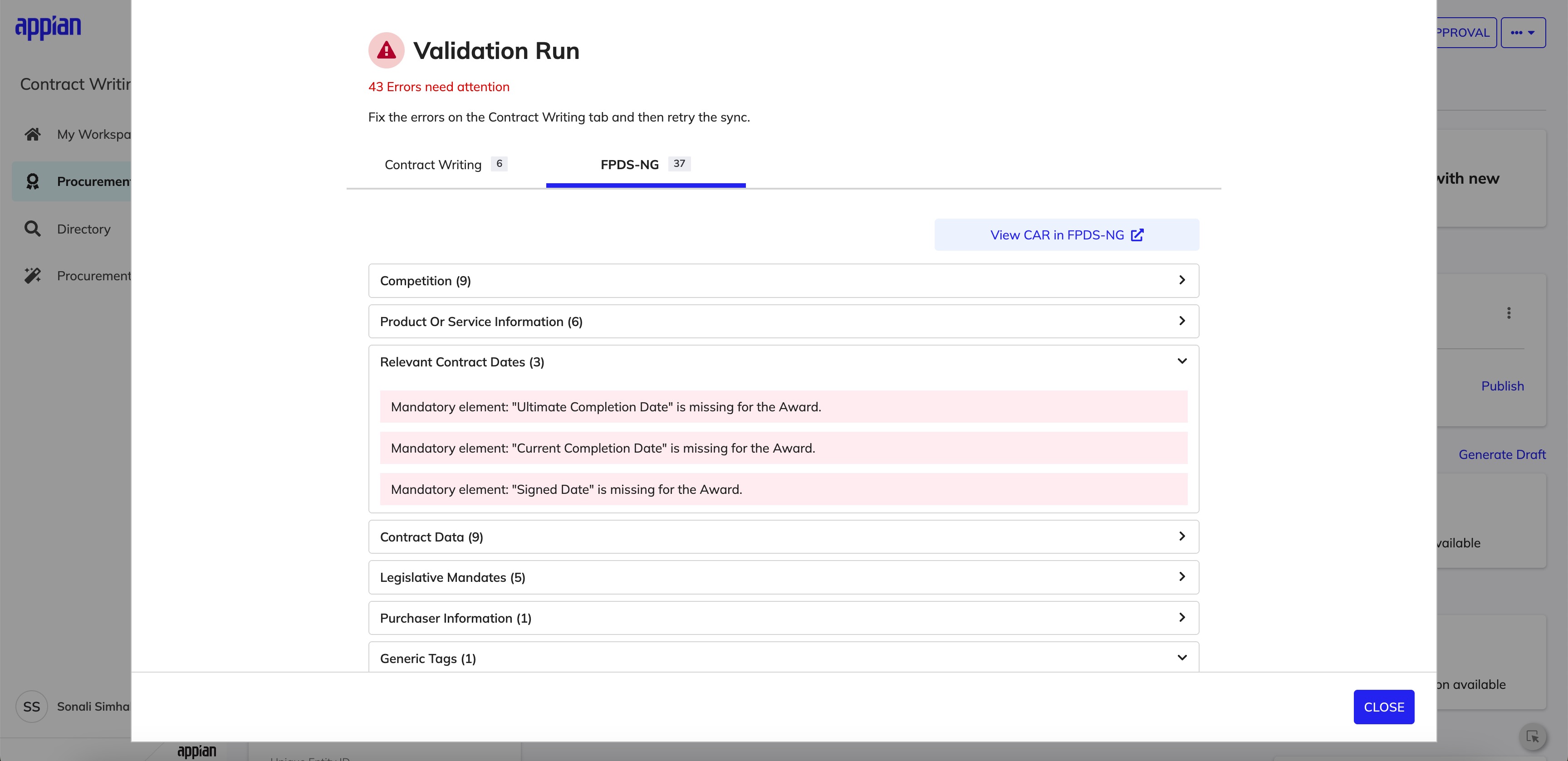
FPDS-NG tab -- errors grouped by category with counts and collapsible detail.
Edge Cases & Award Release
A major part of this work involved designing for non-ideal states: CARs that can't be updated if finalized in FPDS-NG, mandatory errors blocking award release, and sync actions that are hidden or disabled depending on system state. I worked through each scenario with engineering to define precise UX logic that reflects backend rules while maintaining user trust.
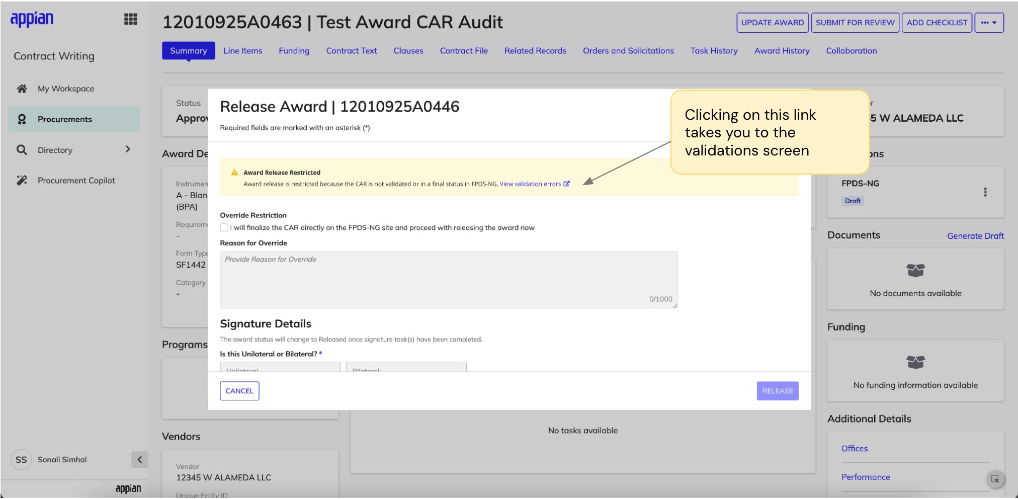
Award release blocked -- clear warning with path to view and resolve validation errors.
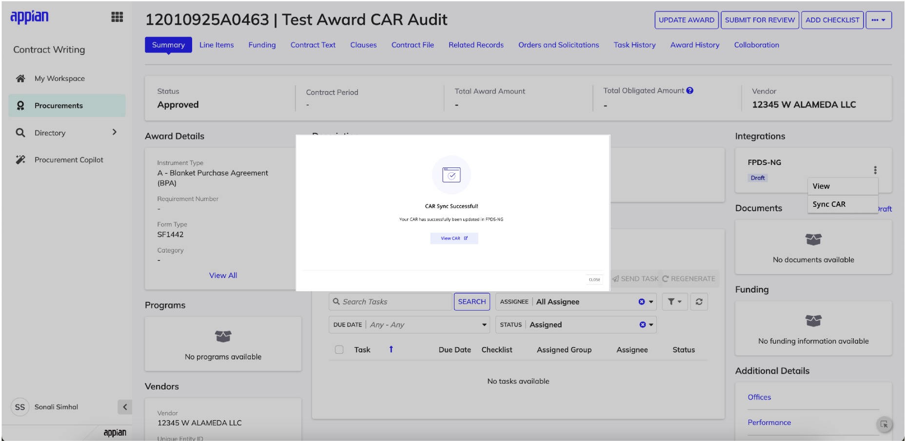
Success state -- clear confirmation with a link to view the synced CAR in FPDS-NG.
My Influence & Tradeoffs
Advocating for Comprehensive Error Handling
The initial proposal was a simple error toast notification -- a reasonable starting point given timeline constraints. However, I saw an opportunity to do more. Government contracting has real compliance consequences, and I believed users deserved clear guidance when something went wrong. I made the case for a full validation modal with error categorization, sharing research showing that ambiguous error states were a major driver of support tickets in similar systems. The team agreed the investment was worthwhile, and post-launch we've seen a measurable drop in user-reported confusion.
Collaborating on Edge Case Coverage
For edge cases like finalized CARs and mandatory vs. optional errors, the team initially considered handling them with generic messages to keep scope manageable. I collaborated with engineering to find a middle ground: distinct UX for scenarios where user actions differed significantly, while keeping implementation pragmatic. This partnership resulted in clearer error states that eliminated the "what do I do now?" confusion without overcomplicating the codebase.
Impact
Reflection
Error states deserve as much design rigor as happy paths. In compliance-heavy enterprise systems, a clear error state can be the difference between resolving an issue in minutes versus spending hours stuck.
Separating error ownership reduces cognitive load. Tabbing errors by system (CW vs FPDS-NG) was a simple structural decision, but it fundamentally changed how confidently users could triage and resolve issues.
Next step: inline validation. If I had more time, I'd explore surfacing validation errors directly within CW fields -- so users could fix issues without leaving the page they're already on.