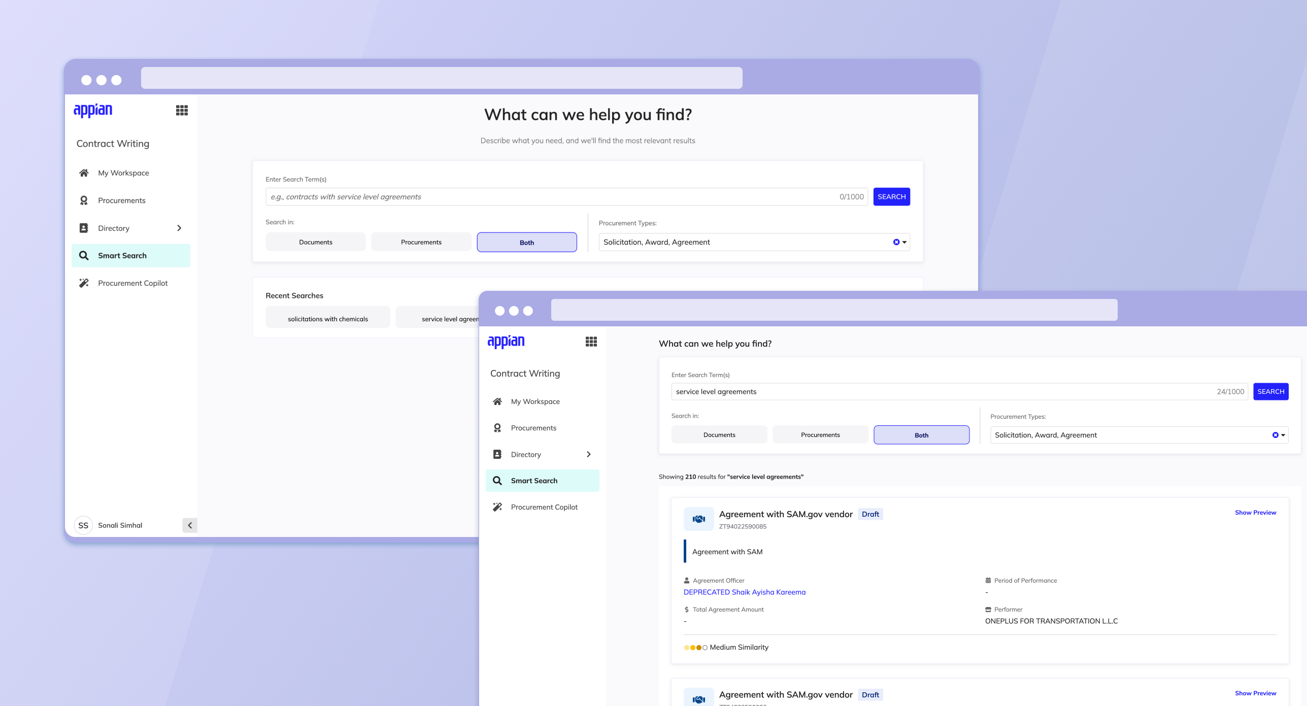
Context
Contracting officers manage massive document libraries: contracts, amendments, renewals, line items, procurement records. Their job depends on finding the right information quickly, but a search that just returns a list of file names doesn't help much. Someone still has to open each document to check if it's the one they need. And in government contracting, getting it wrong isn't a minor inconvenience. It can mean a compliance gap, a delayed audit, or a missed FAR clause.
I designed Smart Search to close that gap. Give users enough context in the results themselves so they know what they're looking at, without losing the exact language and legal detail their work depends on. Balancing fast orientation against precise verification ended up being the thing I kept coming back to throughout this whole feature.
Mapping the Flow
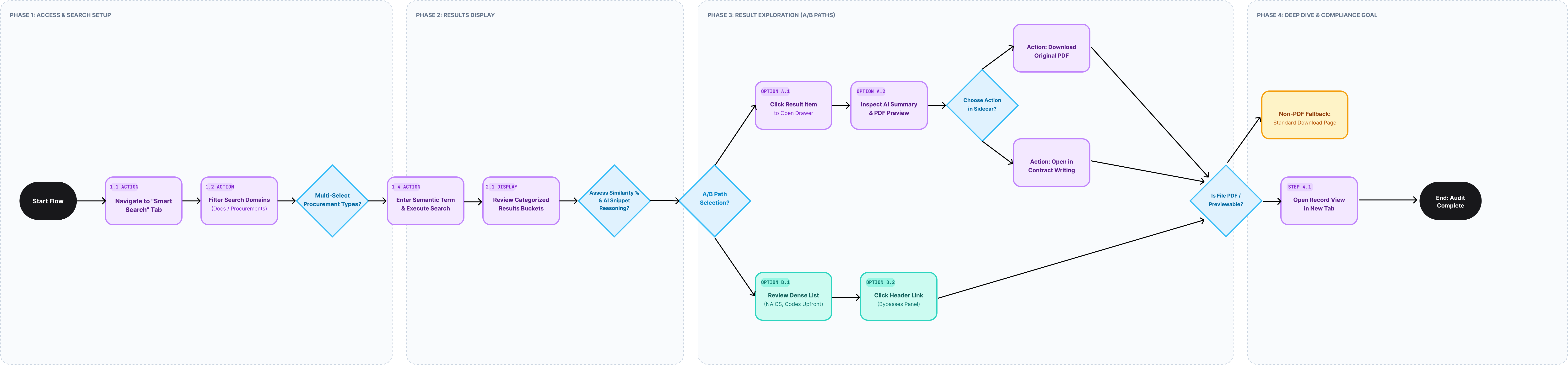
Before designing a single screen, I mapped out the end-to-end user flow so I could see the whole journey at once: setting up a search, scanning results, drilling into a specific document, all the way through to the moment a contracting officer confirms compliance. Laying it out this way made the decision points obvious and gave me something concrete to align product and engineering around before anything got built.
I also didn't map just one flow. I mapped a couple of different options I wanted to put in front of users. The flow branches at the result-exploration step into two paths: Option A, where clicking a result opens a sidecar preview with an AI summary and PDF viewer, and Option B, a denser list view that surfaces the same key information inline without a sidecar. Diagramming both routes side by side let me test each one against the same real tasks, so "which layout is better" became something I could actually validate instead of argue about.
Championing a Bigger Vision
This feature was originally scoped as a small, single-record-type search within Contract Writing. But I saw a bigger gap: the platform had no way to search across procurements, documents, and award data in one place. Users were bouncing between disconnected areas of the system just to find something they already knew existed.
Expanding the scope meant dealing with real disagreement, not just getting people excited about a good idea. An adjacent team building a separate acquisition platform pushed back. Their view was that search shouldn't live in Contract Writing at all, it belonged in their solution, for the sake of one unified experience in the future.
I got product managers, stakeholders, and designers from both teams into the same room and reframed the conversation. Instead of "our solution vs. theirs," it became "what do our users need right now, and what's the best path to get them there." The other team's roadmap didn't have room for this work anytime soon, and asking users to leave Contract Writing entirely just to search within it felt like the wrong tradeoff to make them wait on. I proposed building Smart Search inside Contract Writing now, in a way that could integrate into the broader platform later once that team was ready. That gave both sides something real: our users got the capability right away, and the other team's long-term vision didn't get steamrolled in the process.
We got alignment and shipped it. Feedback from users was unanimous that Smart Search meaningfully improved their efficiency in contract writing, which made the harder conversation worth having.
Internal reviews later confirmed people wanted an even bigger version of this: a single search spanning the entire suite, not just documents. But defaulting a search to pull every data type at once raised real performance concerns, and we were already up against a timeline. So we made a second tradeoff and shipped Smart Search for documents first, proved out the pattern, and pushed the full suite-wide search to a later phase. I'd rather ship something solid that earns trust than something ambitious that breaks under load.
Working Out What Belongs in a Result Card
Before I could design a layout, I needed to answer a simpler question: what does a contracting officer actually need to see about a result before they commit to opening it?
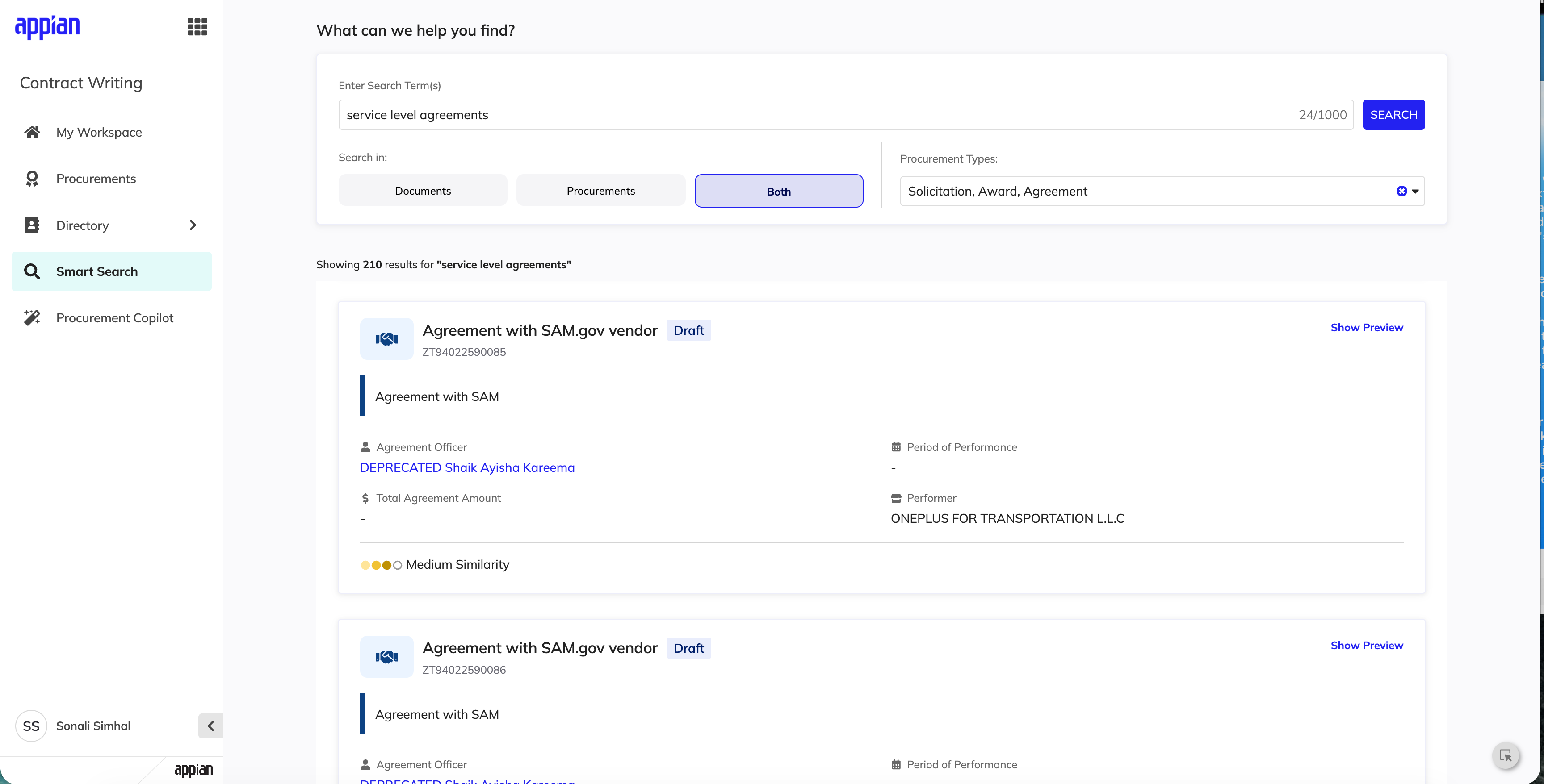
I went through a handful of mid-fi explorations testing different combinations of information: match reasoning, similarity scoring, contract value, vendor, contracting officer, tags, quick actions like opening a procurement directly in CW. Some combinations felt comprehensive but cluttered. Others felt clean but kind of useless. This exploration is what fed the two directions I eventually tested with real users.
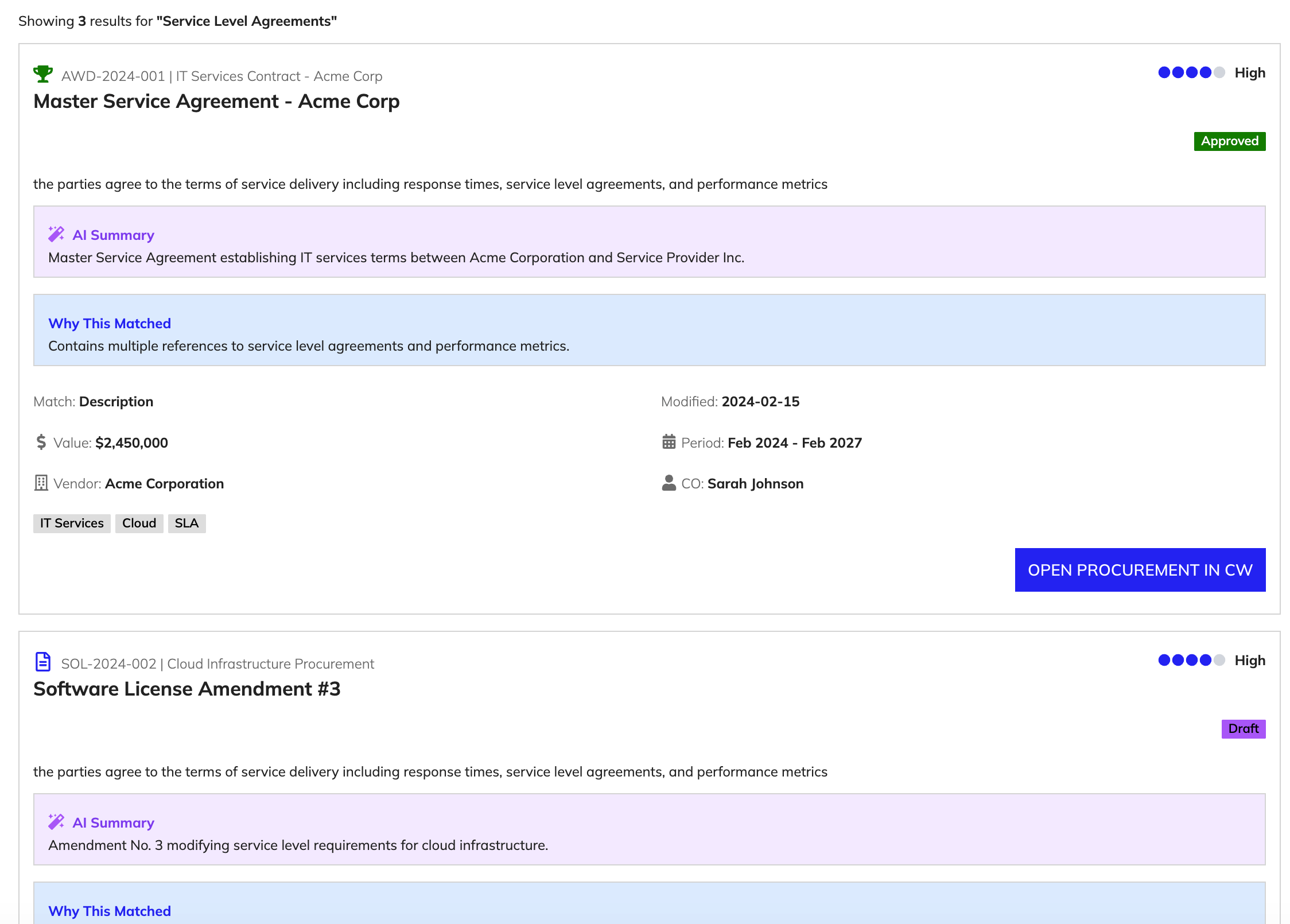
One piece of that exploration, a "Why This Matched" reasoning box, made it into the shipped product, but not in its original form. It now shows up on hover over the similarity indicator (something like "Match based on: description") instead of sitting on the card permanently. That was a deliberate scale-back. Give people the transparency they want without making them process it on every single result.
Figuring Out the Right Entry Point for AI Chat
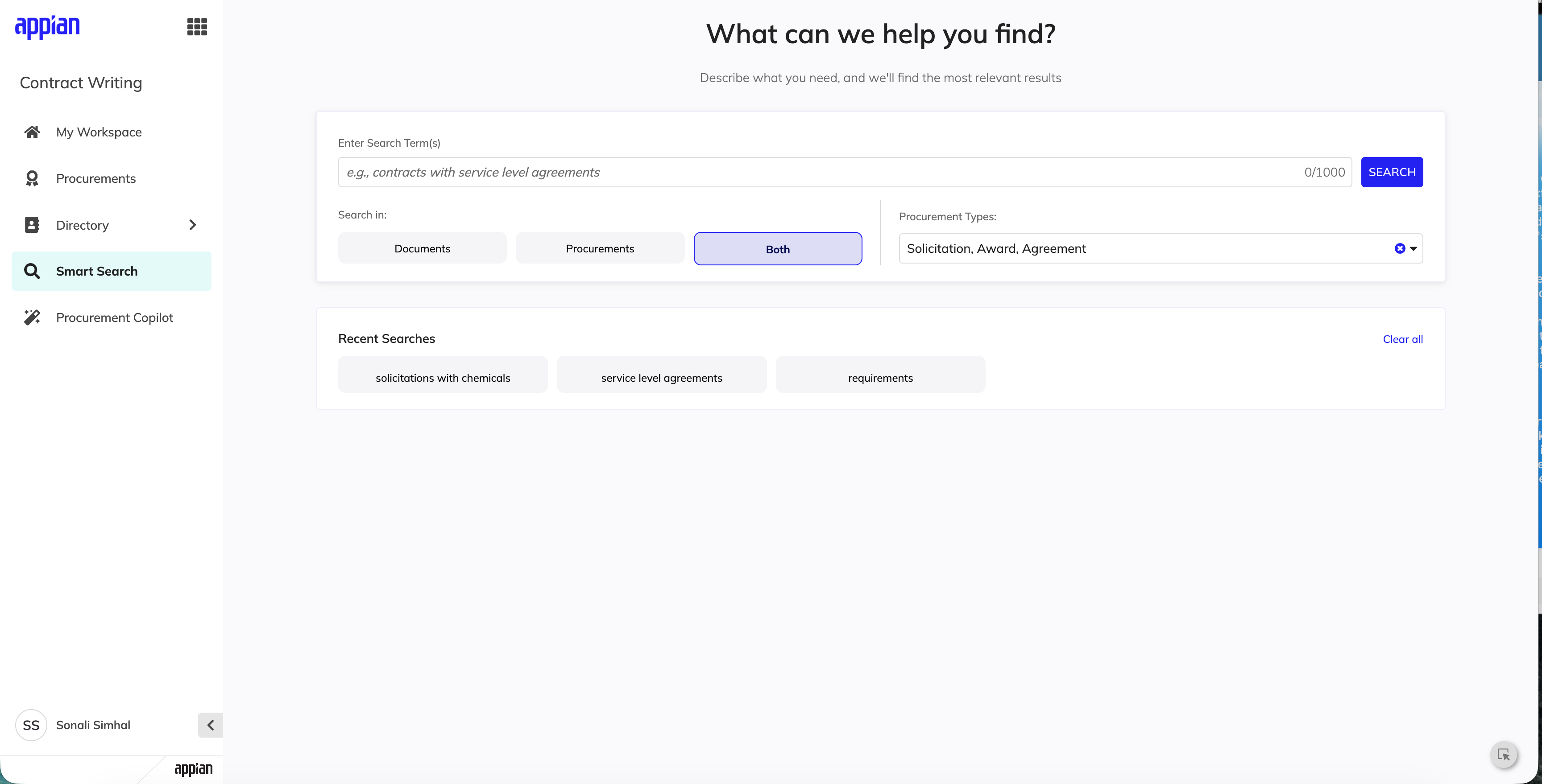
My first concept paired the sidecar preview with a large "AI Document Chat" callout above the results.
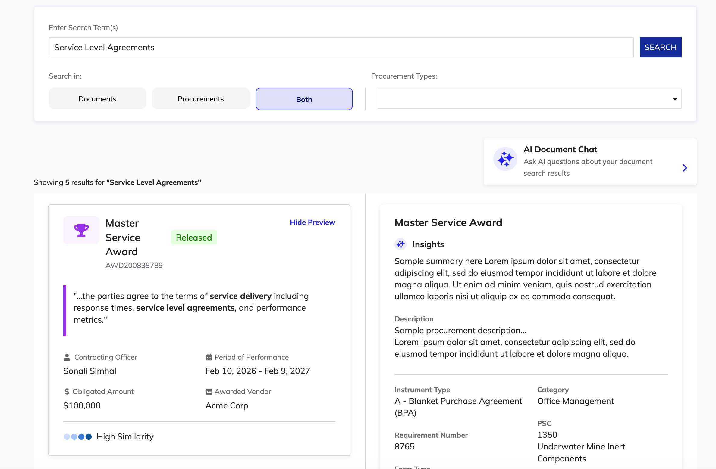
Testing this version surfaced a real problem. The callout showed up any time someone searched across both documents and procurements, but AI Chat could only reference document results. People would see a prominent invitation to ask questions, click it, and find out it didn't apply to half of what they'd searched. That kind of thing erodes trust fast. An AI feature that overpromises even once makes people second-guess it everywhere else.
I scoped the entry point down to a contextual link that only shows up when the "documents" filter is active. Smaller footprint, but it doesn't claim to do something it can't. That's the version that shipped.
Testing Two Directions
With the information architecture and entry points settled, I ran usability sessions testing two distinct layouts for how results should display.
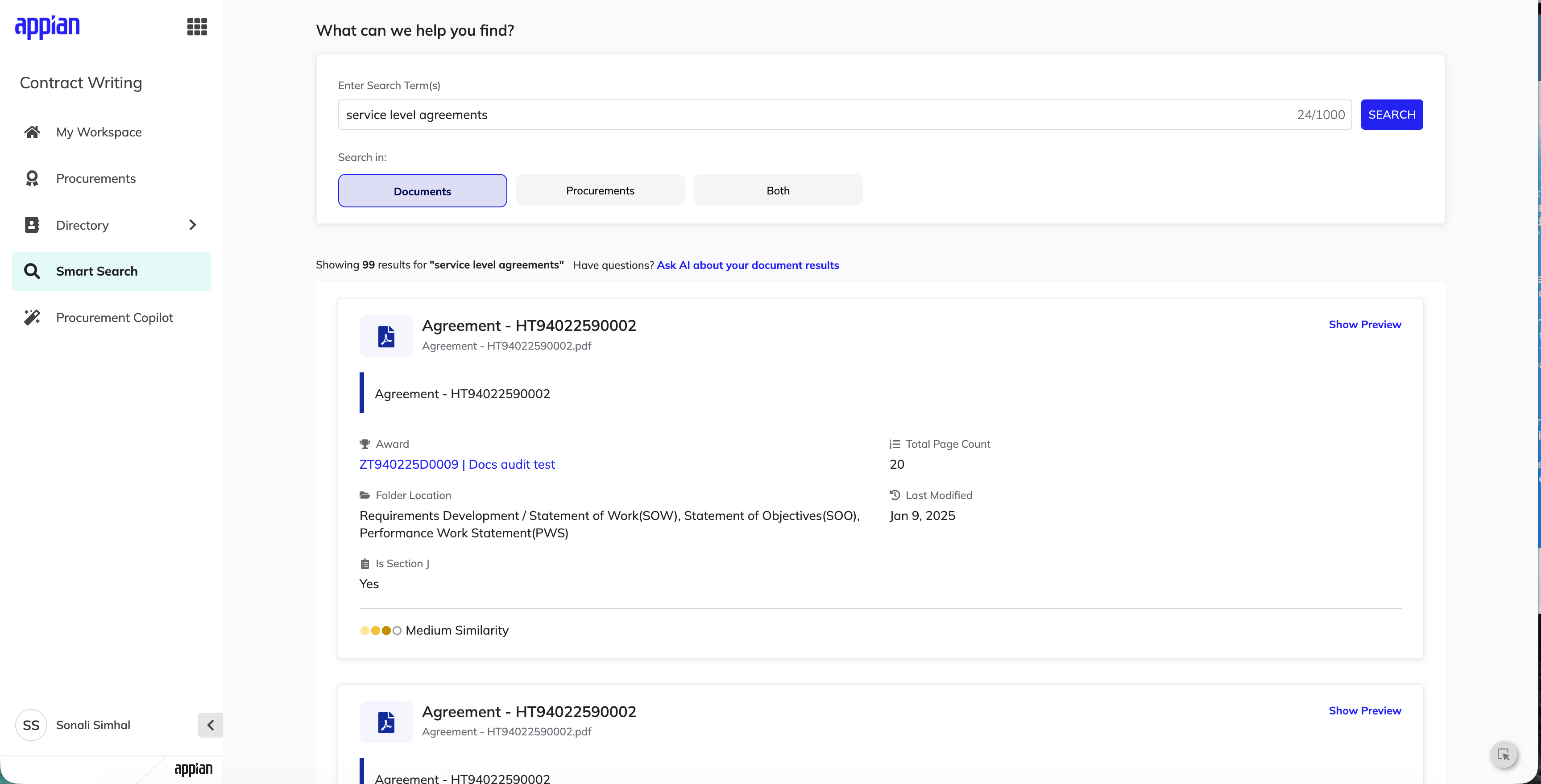
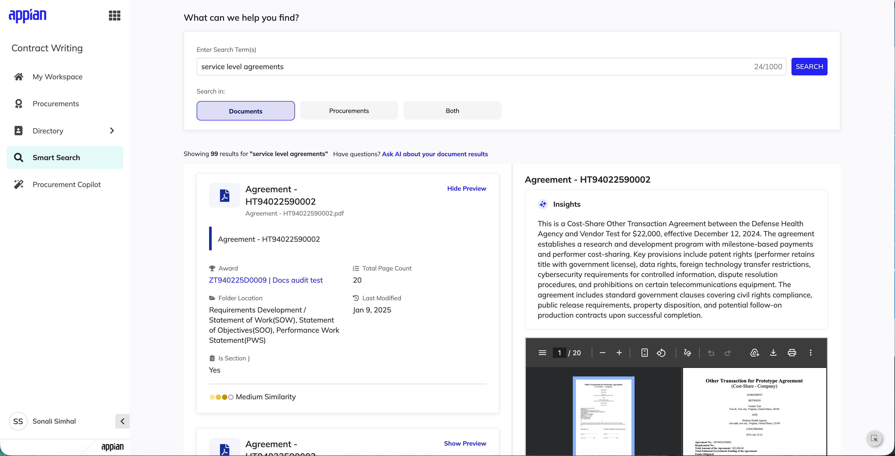
Option A: Sidecar Preview
Clicking a result opens a right-hand panel with an AI-generated summary, match reasoning, contracting data, and a collapsible PDF preview.
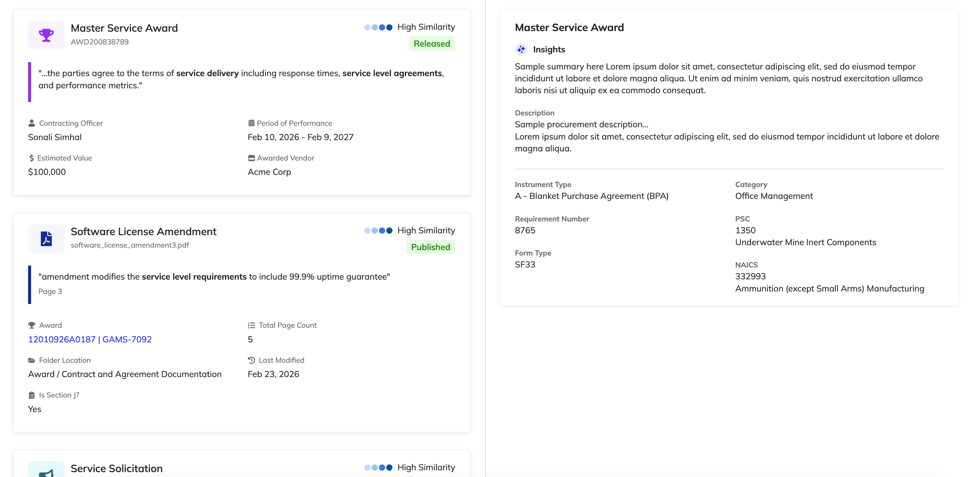
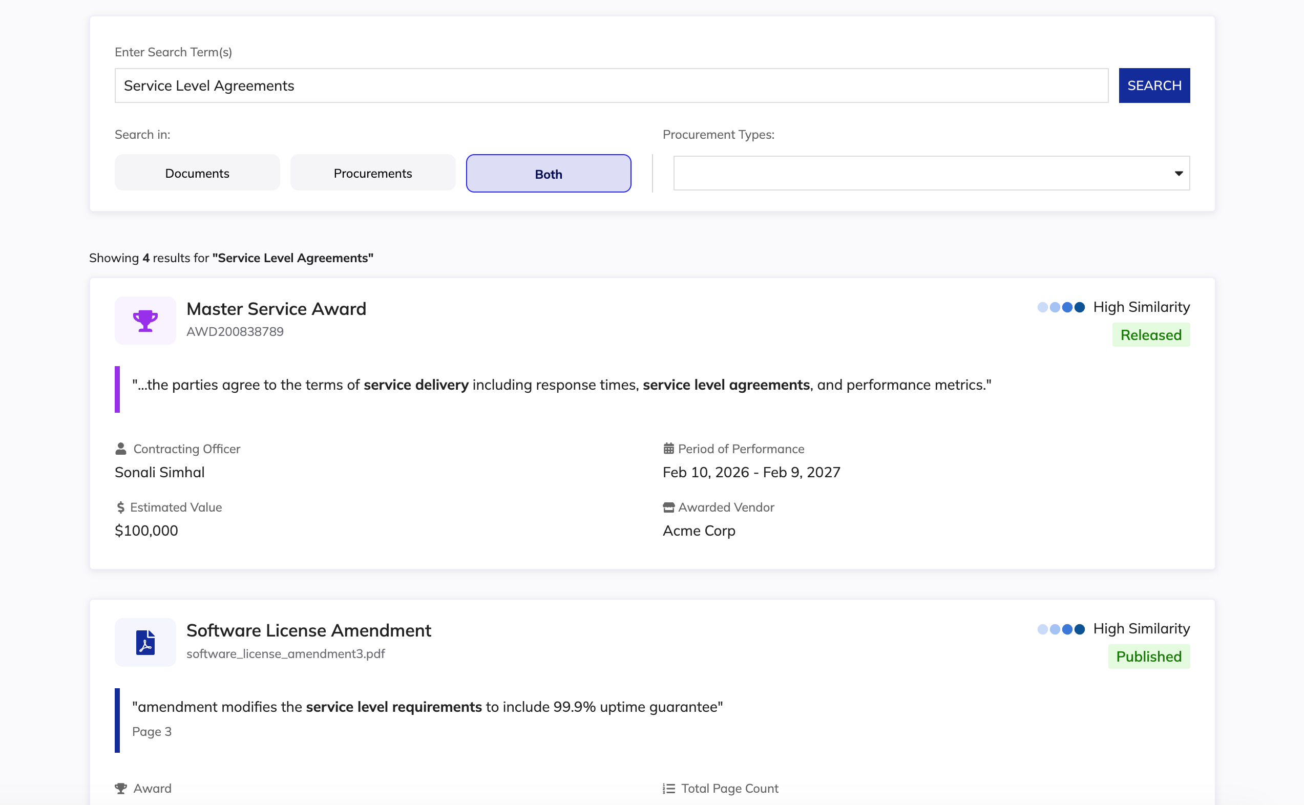
Option B: Utilitarian List View
No sidecar. The main results list surfaces more upfront: summaries, match reasoning, and key data like NAICS codes, in a denser layout.
What I Learned
The two testers split cleanly, and the reasons behind that split mattered more than either individual preference.
One tester, who reviews contracts as part of her daily work, preferred Option A. She could scroll a document preview and tell in seconds whether it was relevant, without leaving her search session. The upfront detail saved her a click and a context switch every time.
The other tester pushed back on Option A's centerpiece, the AI summary. In contract writing, he said, a summary just isn't enough. Contracting officers need the exact legal language, the surrounding paragraph, and often a specific FAR clause. Not a paraphrase of one. He preferred Option B's denser, more scannable layout because of that.
That disagreement shaped my thinking more than either preference on its own. AI summarization is genuinely useful for orientation, but it can't replace exact-text retrieval in a compliance-heavy workflow. Both testers agreed on this independent of which layout they liked, and it became the design principle I carried through the rest of the feature.
They also both landed on the same ask regardless of layout: once someone finds a result, the system should take them directly to the exact page or paragraph where their search term appears, and search should reach into attachments, amendments, and line items, not just the master document. That kind of feedback is easy to deprioritize because it seems like "just" navigation, but for someone verifying compliance under time pressure, it's the difference between confidence and doubt.
The Preview System
The A/B test didn't really produce a clear winner. Both testers were right about what they needed, they just needed different things at different moments. So instead of forcing a choice, I designed for both. The sidecar preview stayed as an available option, not a default. Previews don't pop up automatically the moment someone searches. They open when a user chooses to look, so the results view starts out clean and scannable, and the depth is there whenever someone actually wants it.
I designed three preview treatments based on content type:
Record Previews
An AI-generated summary plus key details, so users can understand what a record contains without opening it. Generation was scoped to on-demand rather than auto-loading for every result, after we spotted a performance risk in generating summaries for full result sets automatically.
PDF Document Previews
An inline viewer that renders the actual document, so users can scroll and verify the real text before opening the full file. This mattered the most given what I'd learned. People needed to see the source, not just a summary of it.
Non-PDF Document Previews
For Word docs, spreadsheets, and similar files, we show metadata and a download option. No preview, but still enough to identify the right file without downloading everything.
AI Chat Integration
I pushed for adding AI Chat to Smart Search after watching users struggle with large result sets. Even with previews, they still had to mentally piece together information across multiple documents to find what they actually needed.
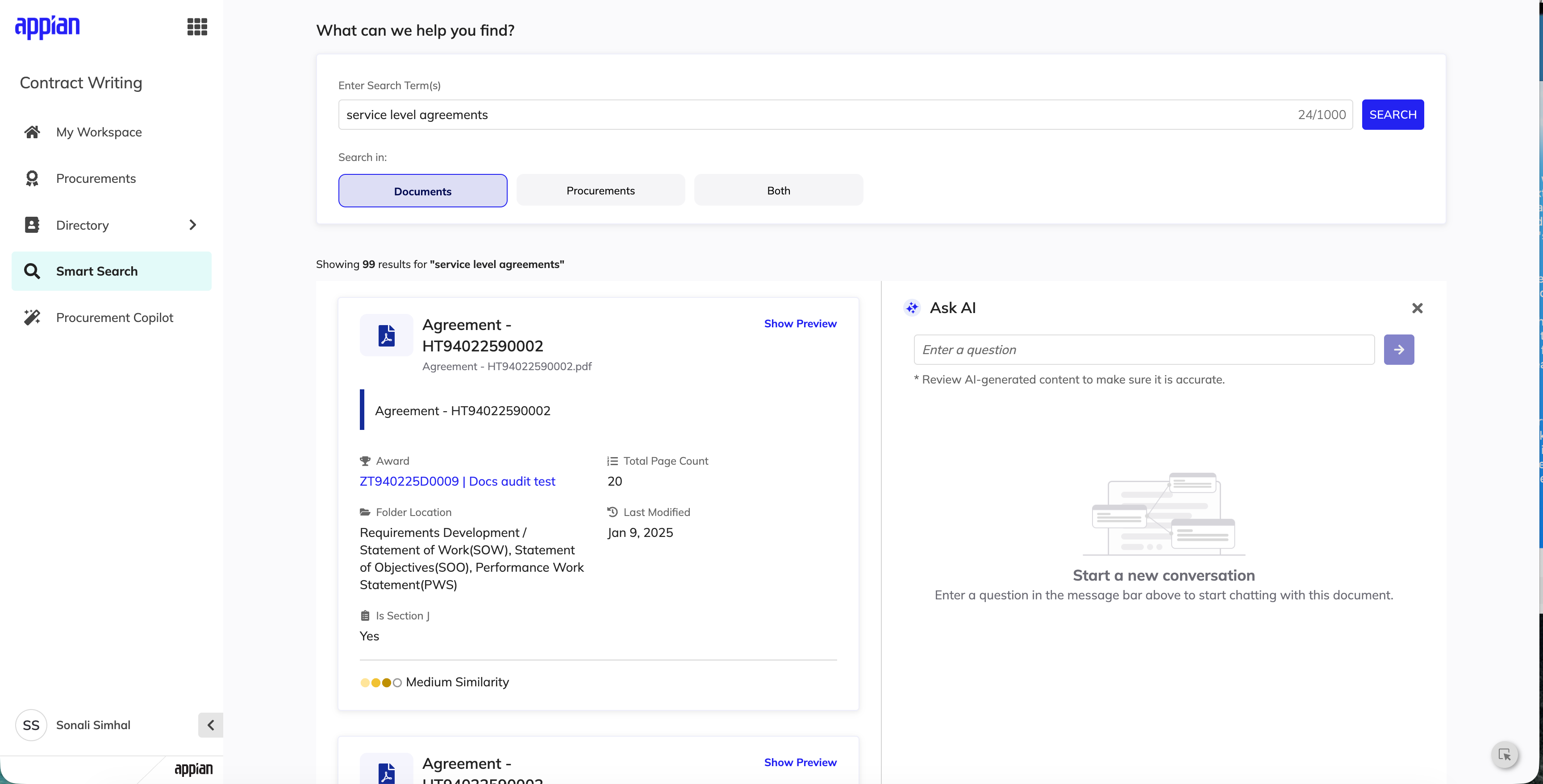
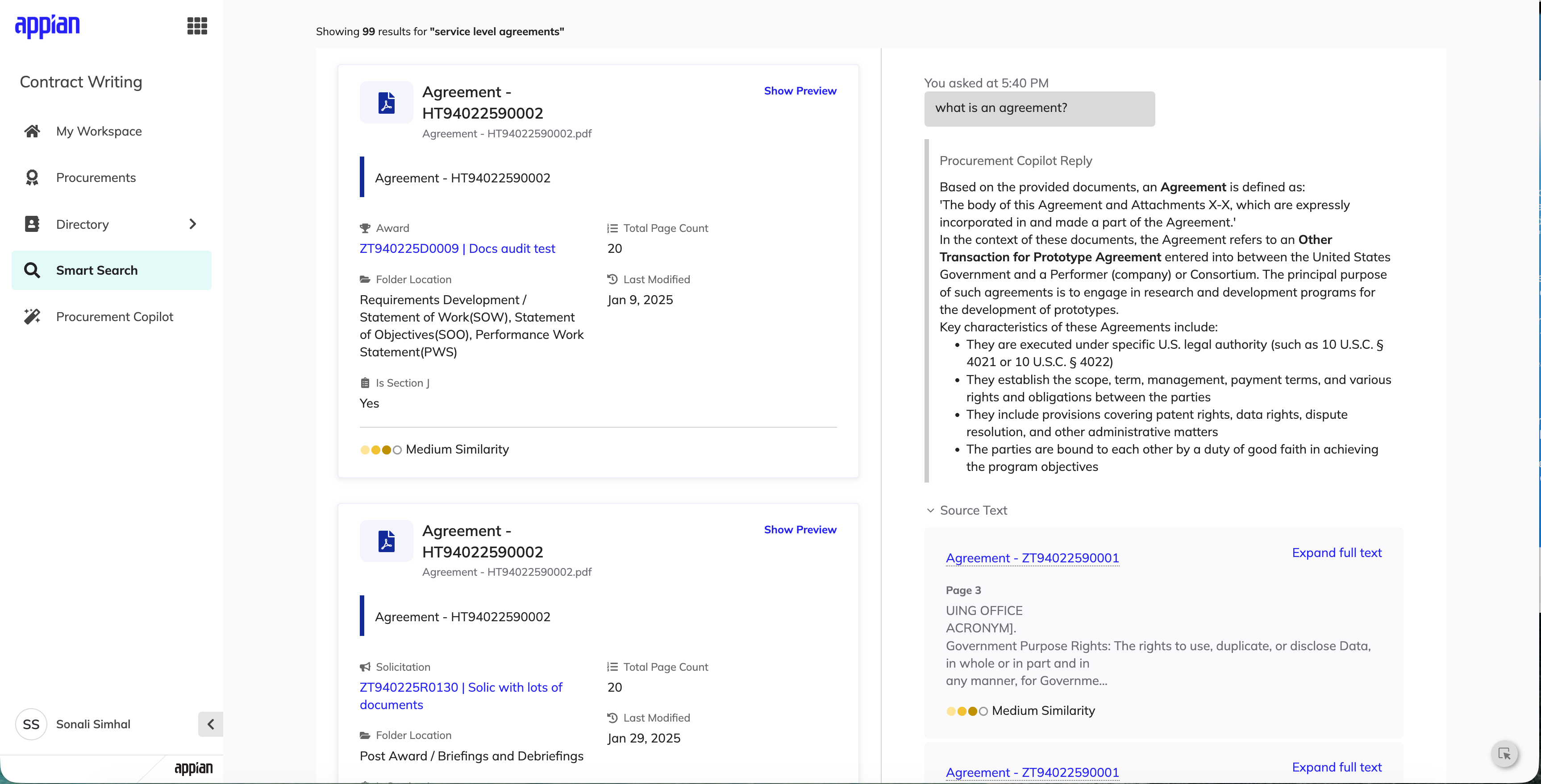
The idea was simple: let people narrow down their search and pinpoint an answer without opening every document one by one. When someone searches with the "documents" filter active, a contextual link opens the Procurement AI Copilot, which automatically references every PDF in the results. It's basically like having a research assistant who's already read everything you found and is ready to answer questions, scoped only to where it's actually useful.
Every answer comes with expandable source citations pointing back to the specific document it pulled from. Nobody has to take the AI's word for it. If something matters, they can check it against the real source in two clicks.
Impact
Created a capability that didn't exist.
Before Smart Search, Contract Writing had no way to search across the product at all. Finding anything meant knowing exactly where to look and getting there manually. There was no single place to search.
Replaced fragmented navigation with one unified experience.
Contracting officers can now search across documents and procurements in one place instead of hunting through disconnected areas of the system for something they already knew existed.
Went beyond basic search.
Rather than shipping a simple keyword lookup, the feature does the work of surfacing context -- AI summaries, match reasoning, inline previews -- so users can evaluate relevance without opening every result.
Validated directly with the people who'd use it daily.
Usability testing with contracting officers confirmed the core design decisions before launch, including the tension between fast orientation and legal precision that shaped the whole preview system.
Key Design Decisions
Show/Hide Toggle for Previews
This was the direct answer to a tied test. Instead of picking Option A or B, I let users choose per search. Previews stay hidden by default so the results list isn't overloaded with information nobody asked for yet, but the depth is one click away for anyone who wants to scroll a document before opening it.
Thoughtful Empty States
Easy to overlook, but critical moments for guidance. I designed empty states that explain what to do next and help people understand what the search system can actually do.
Contextual AI Entry Point
The AI Chat link only shows up when it's relevant. I learned that the hard way from the version that didn't.
On-Demand Match Reasoning
Transparency into why a result matched, available without cluttering every card by default.
Reflection
A lot of this feature comes down to one idea: never let the AI's confidence exceed what it's earned. The similarity score tells people how sure the match actually is. The AI summary sits next to the real document instead of replacing it. The AI Chat only shows up where it's scoped to answer honestly, and every answer it gives links back to the source it came from, so nothing has to be taken on faith. None of these are flashy decisions on their own, but together they're the actual guardrails, the thing that keeps an AI feature trustworthy instead of just impressive in a demo.
Designing search for people who verify legal compliance for a living taught me something I want to carry into any AI-powered tool I work on. Speed and precision aren't really competing with each other, they just show up at different moments. People want to move fast to find the right document, and then they want to slow way down and read the actual words once they get there. My job wasn't to pick one over the other. It was to design a system that respects both moments, and to build enough trust into the AI parts that people never have to wonder if the summary is hiding something the real document would've told them.
That's the kind of problem I want to keep working on. Not just adding AI somewhere it seems useful, but making sure the people using the tool are never worse off because the automation is there.
Smart Search was designed as part of my work leading UX for Appian Contract Writing, a $2.5B+ government procurement platform.